Eventbrite Neon
Stylized Logo & App Icon
Eventbrite had decided on naming their organizer app “Neon” and wanted some on-boarding and icon treatment to match. I was pulled into the project and made some animations and logo treatments. I also designed a mono-space set of numerals inspired by neon signs for usage as a countdown timer.


Countdown Numerals
I had never drawn a font before. This was a much less extreme version of that, but had several interesting constraints. Because we wanted this to reference the look of a neon sign I decided to draw all the numbers using the same set of pathways (visible in light grey). It gives the numbers a kind of unique but consistent look.

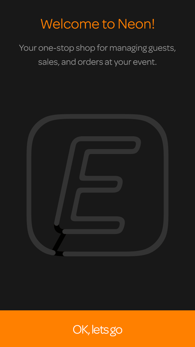
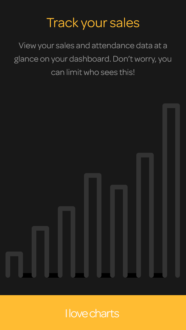
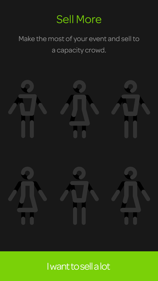
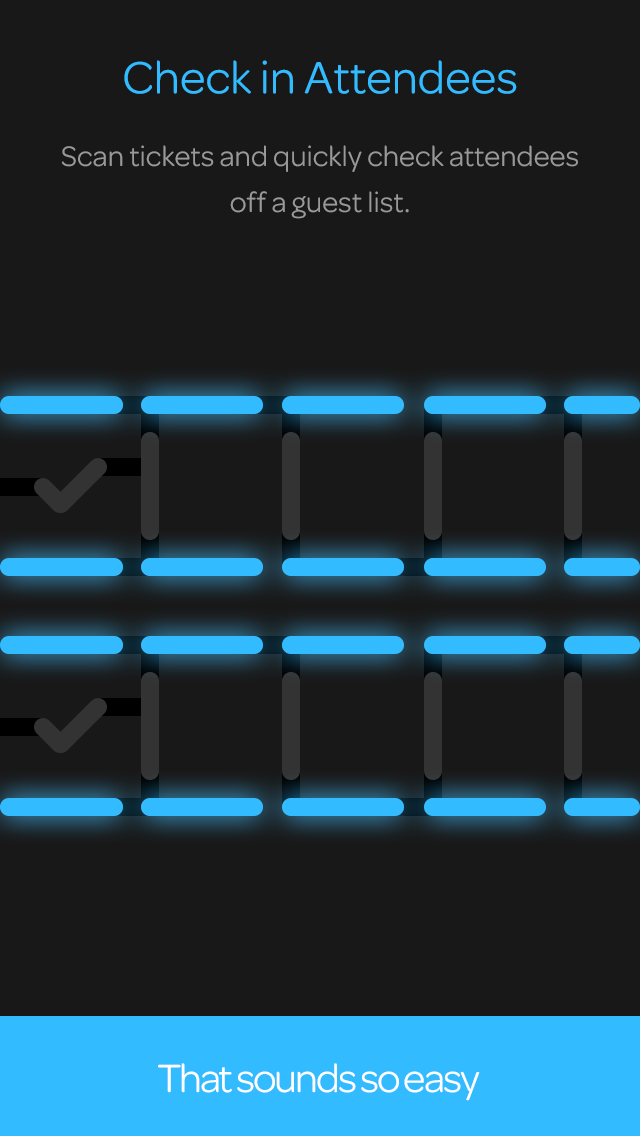
On-Boarding Screens
We wanted to lean into the name “Neon” so for the on'-boarding screens I had them flicker on like a neon sign would. The whole Neon app was darker than the normally light and bright tone of the main Eventbrite app. So it allowed us to use pops of color, which was a nice change of pace, and felt more professional.