
Twitch Design System
At Twitch I worked first as a Senior, then as a Principal Designer on the Design Systems team (known internally as Core UI). My primary focus was on the Web kit where I made all new components, maintained existing components, and wrote documentation. Core UI is on a 6 week release cycle, where both the design kit and code would go out simultaneously.
Responsibilities
Here is the stuff I did at Twitch:
Updated the library to use Figma’s latest features, and increase ease of use while managing library size.
Drew most of our Illustrations
Drew nearly all of our icons for web and mobile
Checked Core UI Engineer Pull Requests on github and in Storybook
Built new web components. I also totally rebuilt the Web UI Kit from scratch in 2019.
Maintained existing web components.
Wrote component documentation
Weekly critique meeting where my team would go through all of the new in progress designs posted to our review software, and identify potential issues with accessibility, or off pattern use of components.
Weekly office hours where designers could sign up to ask questions about accessibility, component usage, request figma help, etc.
Worked 1:1 with feature designers to improve their usage of the design system and to elevate the accessibility of their designs.
Developed a series of training video tutorials explaining how to use the design system, as well as Figma generally. These videos were for asynchronous learning during COVID. The training starts at basics like explaining what a Library is all the way to advanced stuff like building Components using variables, variants, and advanced auto-layout techniques. There was even a “Figma for non-designers” that went into how engineers and PMs could best utilize Figma and learn how to feel comfortable navigating it.
Developed a Boot Camp where I conducted 2 day, 2 hours each day training session to teach Figma to the Twitch design org.
Web UI Kit
I joined Twitch in mid-2019 just before a brand refresh called UV. Shortly after I joined I realized that the whole library had to be rebuilt. I built all the previously-existing components from the ground up using variants rather than what they had been using, which was a separate layer for each state, and the visibility turned off. In the old components changing states would reset your button text, and everything was extremely brittle. It was kinda a nightmare. Variants also allowed me to go from 96 different insert-able buttons down to 6. The design kit was also massive, so early on memory usage was a constant issue. With my re-build I was able to optimize the kit and reduce its size to a fraction of what it was.
The design kit is really large so I’ll just show a couple notable parts in detail.
The components are all divided up into pages (assembled into a single view above, but this isn’t how it exists in the kit). Each page has an overview, which shows how that component can be used, and what its capabilities are. The actual Figma main component is defined next to the overview page.
All of the info that designers need is in Figma. Then I have it linking out to our documentation website which has more information catering to engineers. The props engineers use and the variants, designers use use a consistent set of language to make communication as clear as possible.
Buttons
When I joined the Figma libraries were really inefficient and difficult to use. Each button state, for example was a layer in a button component that had to be manually turned on and off. The text in each of these layers was not connected in any way so when you went from from a non-hovered to a hovered button the text would reset.

On the left is what the button looked like prior to my rebuild. Note that there are no properties and all adjustments are manual. On the right is the button after my rebuild. Way fewer layers, everything easily controllable by properties. Through this rebuild I was also able to reduce the 96 insert-able buttons down to 6.
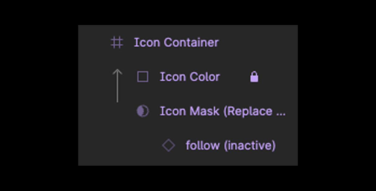
Because at Twitch all icons are a single color I was also able to come up with this method of applying color that allowed us to just ignore the color an icon is assigned from the icon library and assign the color we want it to be within our component without overriding. It uses a color layer masked to the shape of the icon path to achieve this result.
Here is an example of the overview page for Button, one of the Twitch primitives.
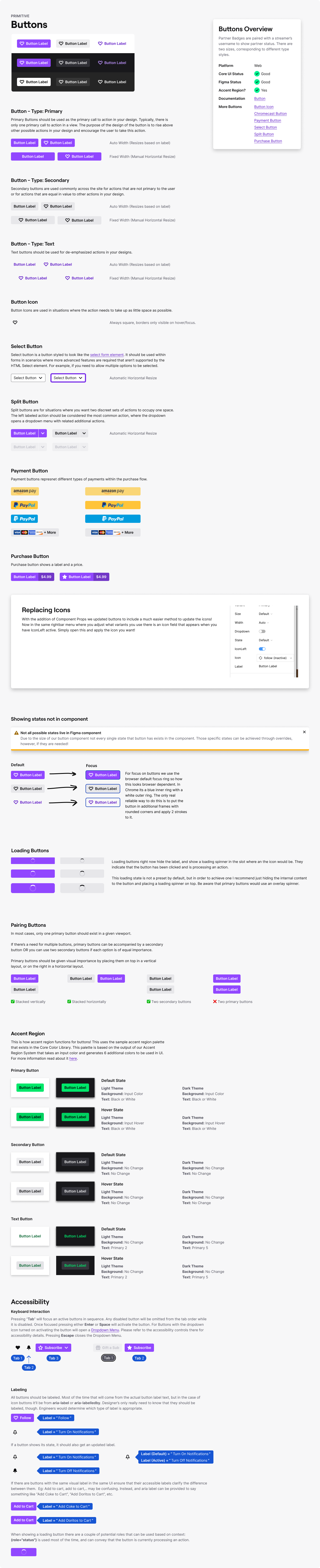
Button Overview
In Figma the button’s variants are set up so they match the props that engineering uses in code. There are also quality of life features thanks to Figma’s component props, so if I have the left icon disabled it doesn’t show me the options for icons since I don’t need it at that moment.

Media Cards
Media Cards are a bit more complex than buttons and represent one of the system’s many patterns. Patterns assemble multiple primitives like Tag, Avatar, Core Text, etc into a more fleshed out UI opinion. This pattern specifically posed some unique problems when building it in Figma, such as Figma not natively supporting a forced aspect ratio that works within an auto-layout. I eventually found a solution through the “Friends of Figma” Slack community and the users Chudo and Solo Cube. You can see Chudo scrolling through the conversation in this “Pushing Figma to its Limits” presentation from Config 2021.
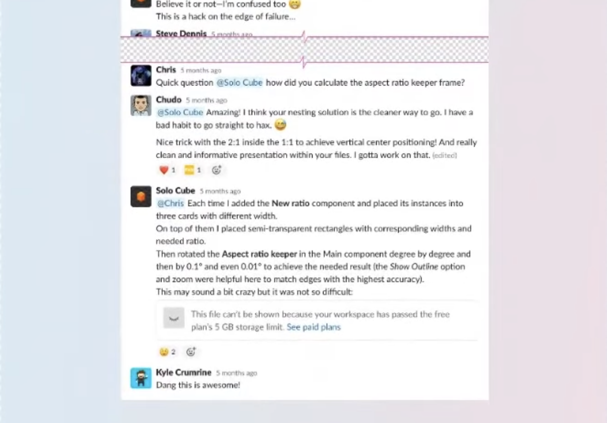
Screen cap from Chudo’s portion of “Pushing Figma to its Limits” presentation.
You can see me at the end being supportive, again I didn’t invent this, but I was among the first to use it. The solution uses some quirks with auto layout to use either a zero pixel frame or zero pixel vector path to stretch at a certain angle that when paired with “fill container” horizontally, and “hug content” vertically, produces a frame that resizes at a specific ratio. For instance, rotating the vector path to 30% produces a 2:1 ratio, which you can then stack to get a perfect square. Rotating the vector path to 34.23° produces a ratio that is within a margin of error of 16:9. You can get all sorts of ratios like 4:3, 3:2 etc by stacking 2:1, or 1:1 aspect ratios in different orientations as well.
Since Feb 2025 this kind of thing is now supported natively in Figma without the need for this hack.
With aspect ratio solved, I made components for all of the art assets and have those living in a separate library specifically for art. These components are just simple images, no forced ratio. The ratio is inherited from the aspect component this art is consumed by. This allows any art asset to be swapped with any other and makes managing the art assets themselves really straight forward. With each art asset categorized into a folder by adding a “/” to the naming in Figma (e.g. 16:9 Art/Sekiro) and using an instance swap component prop within our “aspect” component it allows easily swapping art for anything of the same selected aspect ratio.

The Twitch Art Library.

A Media Card showing the menu in Figma to select different art.

Media Cards Overview
Variables
During Config 2023 Figma announced variables. The following day I lead an initiative to get our entire set of design libraries update to variables. I made a new theme file with all of our previous theme files combined, and updated the web library myself. I then trained the other designers on my team how to do it for the mobile library.
This was a huge success, and resulted in our library sizes being cut in half. It also made it far easier for feature designers to use the Design System, since now they can just set a containing element’s layer mode to the desired theme and all of the screens inside that container automatically change.

Here is a sample of the variables setup
The way I have it set up is so there is a Core Themes file where all the color variables live, and all libraries consume those colors so Web, Mobile, and TV apps all ingest the same color tokens.
HSL to OKLCH Transition
This transition was still ongoing when I left Twitch, but I was leading the charge on a transition away from HSL to OKLCH in order for our colors to be more accessible in the long term as we WCAG 3.0 gets nearer to finalization.
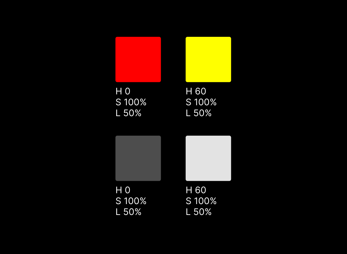
HSL is a fairly simple way of defining colors by choosing a value for Hue, Saturation, and Lightness. The problem is that it doesn’t take the way human eyes work into account so even though a Red and a Yellow may have the same lightness value, the local values are not the same so they result in inconsistent contrast outputs.
Early on in my time at Twitch I had sought to normalize these contrast differences using basic contrast calculations. The result worked for us, but as WCAG 3.0 shifts from standard contrast calculations to APCA (Advanced Perceptual Contrast Algorithm), these colors would no longer be sufficient at producing consistent contrast across the system.

You can see here, even though the contrast values are very similar across the columns the local colors end up looking way brighter or darker depending on the hue. Especially in grayscale.
I sought to improve this by using OKLCH which does a much better job at calculating colors in a way that is more similar to the human eye, much like APCA.

Even in grayscale the OKLCH generated colors look nearly identical and provide very similar APCA contrast results.
Accessibility Annotation Kit
This is something I worked on with our Accessibility and Inclusive Design leader. It is a kit used to annotate designs, establish textual hierarchy, and document expected tab order. It was used by all feature designers when passing designs to their engineering counterparts.

Training
Asynchronous video training
Right after COVID working from home was pretty new to everyone so I wanted to provide a method of self-directing a suite of lessons. By the time I was done I had hours of tutorials available. I would update these videos every time there was a major change to Figma.

Screenshot from video tutorial with target on the left and the one I am building on the right.
Here is a full list of the lessons which total a little over 4 hours in run-time:
Figma for Non-Designers
Libraries
Color
Typography and Spacing
Frames, Groups, and Sections
Components
Breakpoints and Grids
Auto-Layout
Core UI System Structure
Core UI Primitive Deep Dive
Core UI Pattern Deep Dive
Drawing Icons
Creating Components
Using UV Glow (Twitch’s Illustration Style)
Memory Usage in Figma
Boot Camp
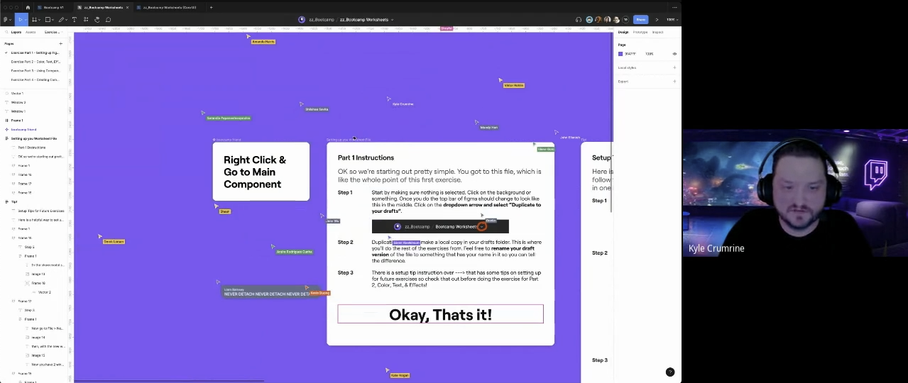
In mid-2023 I also held my first Core UI Boot Camp which was 4 hours over 2 days. In Boot Camp I’d give a presentation about a topic, then have all the participants complete a worksheet about that topic to reinforce the lesson. This Boot Camp was a mandatory training for everyone in the design org, and was a lot of fun.
This is a screenshot of the first worksheet where I had everyone search for a secret component that had been published, and follow it back to the main component, then duplicate the file and follow along with me going through the worksheets. Participants were able to ask me questions and get instruction on resolving common stumbling blocks.
This Boot Camp had 4 parts. The first 3 parts were covered on Day 1, and the last part was the sole focus of Day 2.
Part 1 - Setting up Figma
Part 2 - Color, Text, and Effects
Part 3 - Using Components
Part 4 - Creating Components